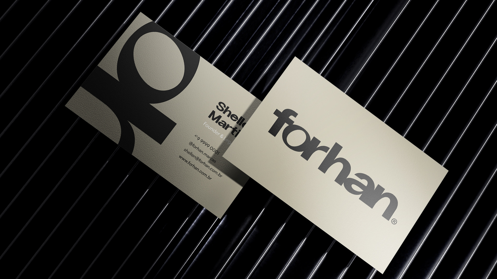

forhan®
_______________________________________________________________________
Identidade Visual
A forhanⓇ nasceu com o propósito de ser o pilar que transforma o registro de marca de uma obrigação legal em experiência de conquista, construindo confiança e comunidade para empreendedores que buscam se destacar.
Mais do que um negócio no segmento de registro de marcas e patentes, é um agente potencializador de negócios, transformando esse processo burocrático em algo descomplicado, agilizado e próximo, sendo esse um de seus principais diferenciais competitivos.
A forhanⓇ existe para negócios que querem crescer com propósito, força e autoridade.
forhanⓇ was founded with the purpose of being the pillar that transforms trademark registration from a legal obligation into a winning experience, building trust and community for entrepreneurs seeking to stand out.
More than just a trademark and patent registration business, it is a business enabler, transforming this bureaucratic process into something straightforward, streamlined, and accessible—one of its key competitive advantages.
forhanⓇ exists for businesses that want to grow with purpose, strength, and authority.


Para o conceito criativo, a ideia foi criar um símbolo modular que representa, como no esquema abaixo, 4 mãos estendidas (como se a parte circular fosse a cabeça das pessoas, com a linha horizontal sendo seus ombros/tronco e a parte curva como a mão para frente).
Além disso, o símbolo sozinho é composto de modo semelhante a uma flor: o círculo como as penas, a linha horizontal como as folhas e a perninha curva como o caule, para passar a ideia de florescimento, crescimento, desenvolvimento e, a partir de suas raízes, permanência e estabilidade, o que toda marca busca.
For the creative concept, the idea was to create a modular symbol that represents, as in the diagram below, four outstretched hands (as if the circular part were the person's head, with the horizontal line representing their shoulders/torso, and the curved part representing the forward hand).
Furthermore, the symbol itself is composed similarly to a flower: the circle representing the feathers, the horizontal line representing the leaves, and the curved leg representing the stem, to convey the idea of blossoming, growth, development, and, from its roots, permanence and stability, which every brand strives for.