[BR]
O projeto
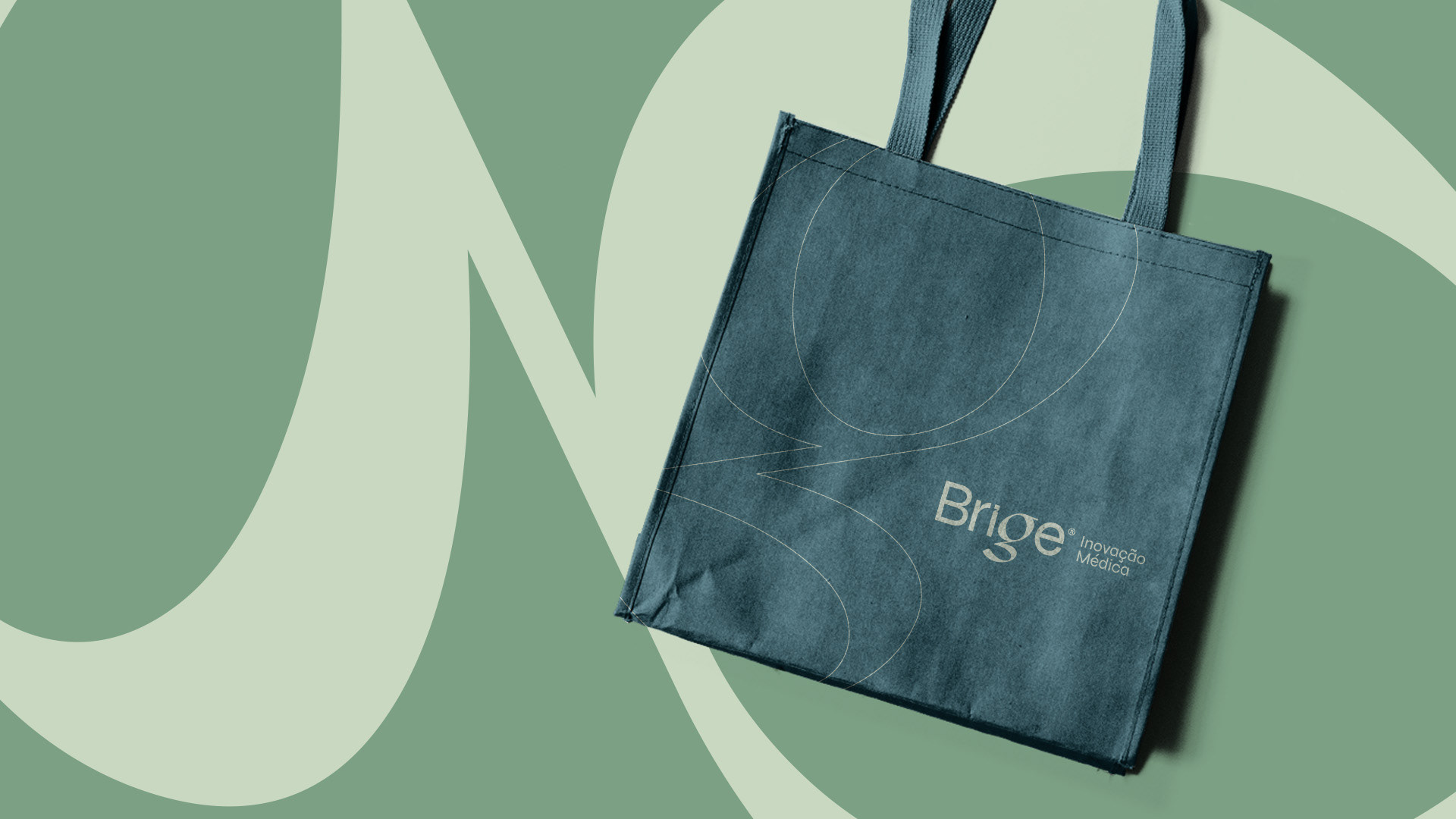
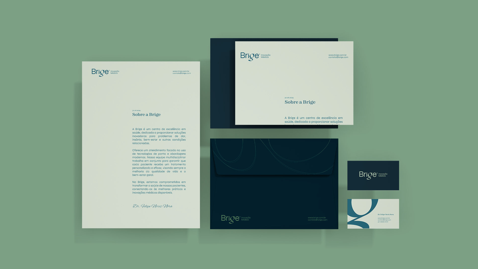
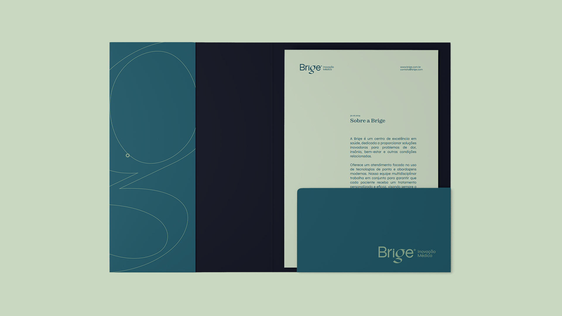
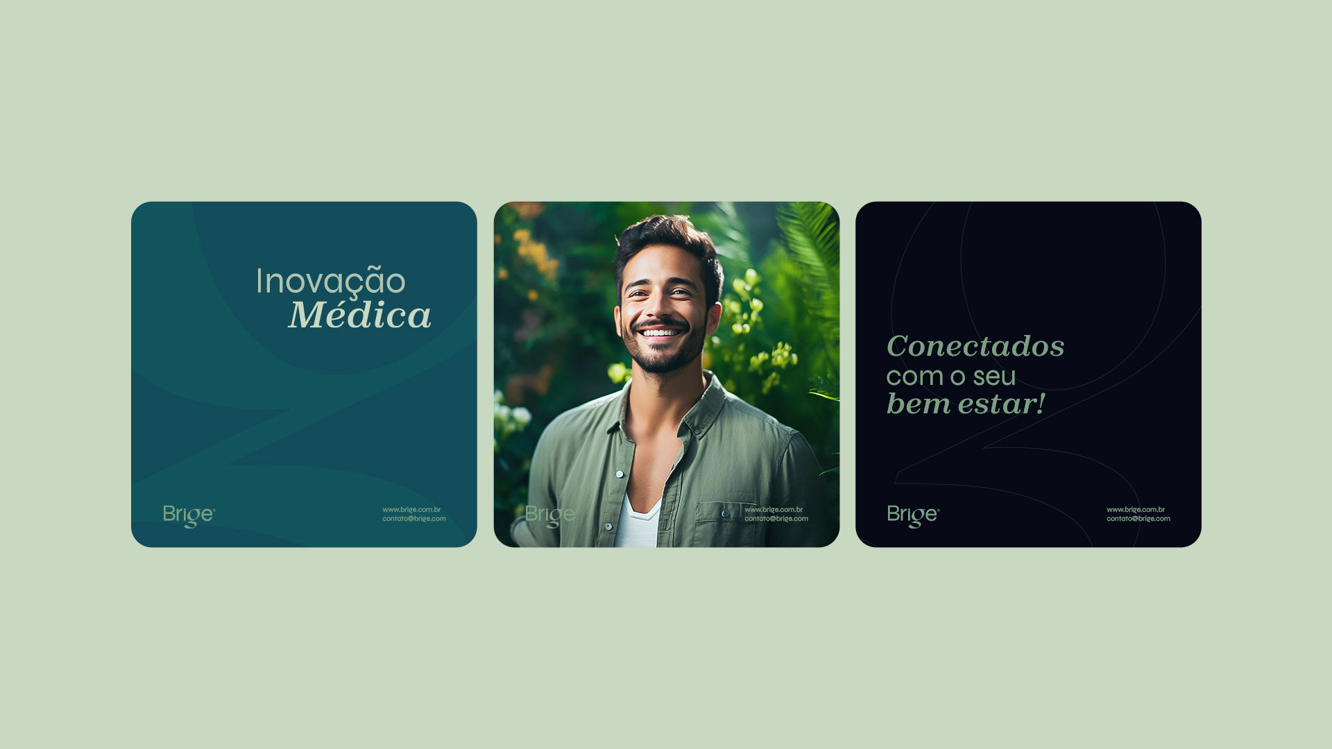
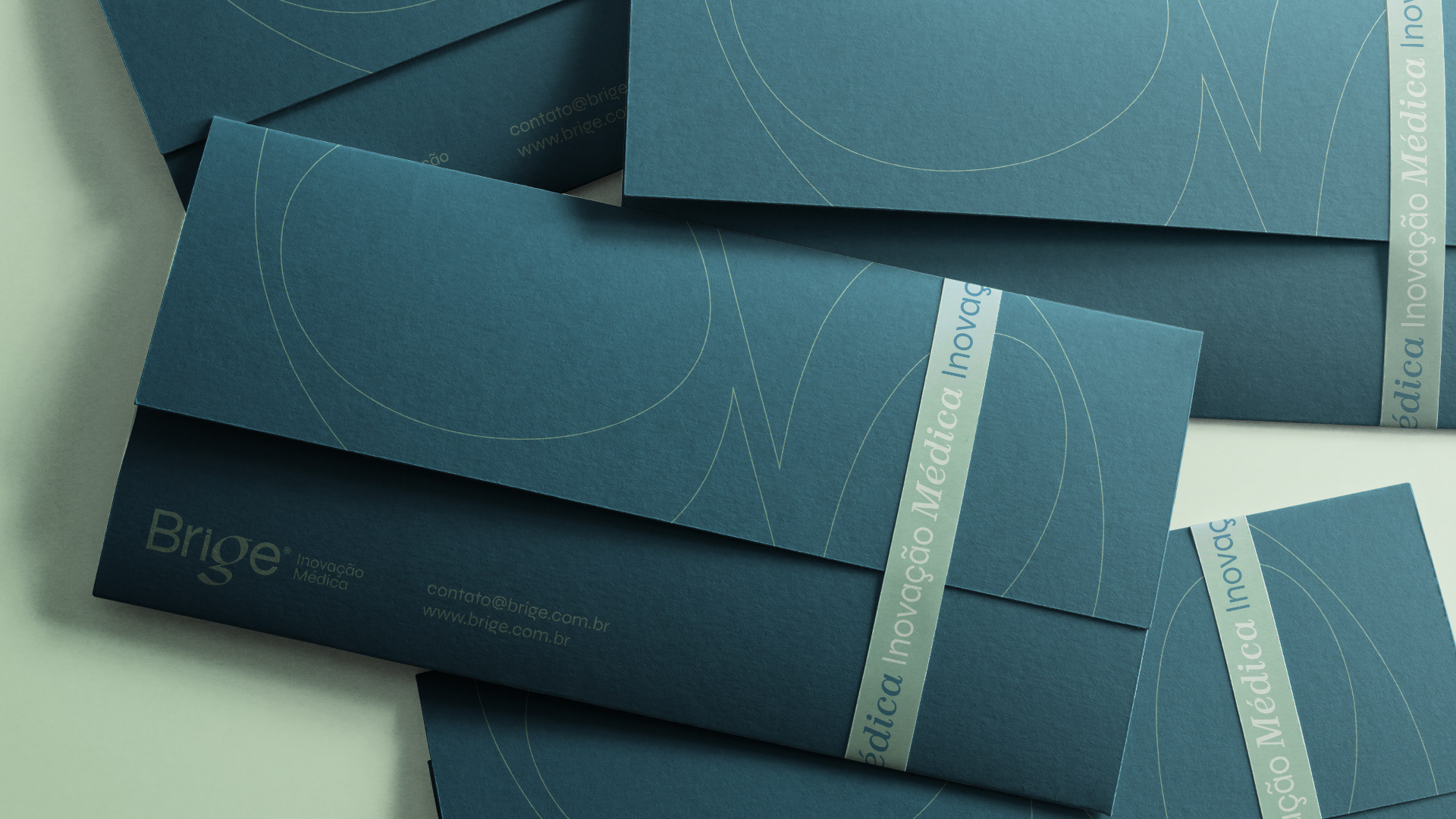
Clínica Brige | Identidade Visual | 2024
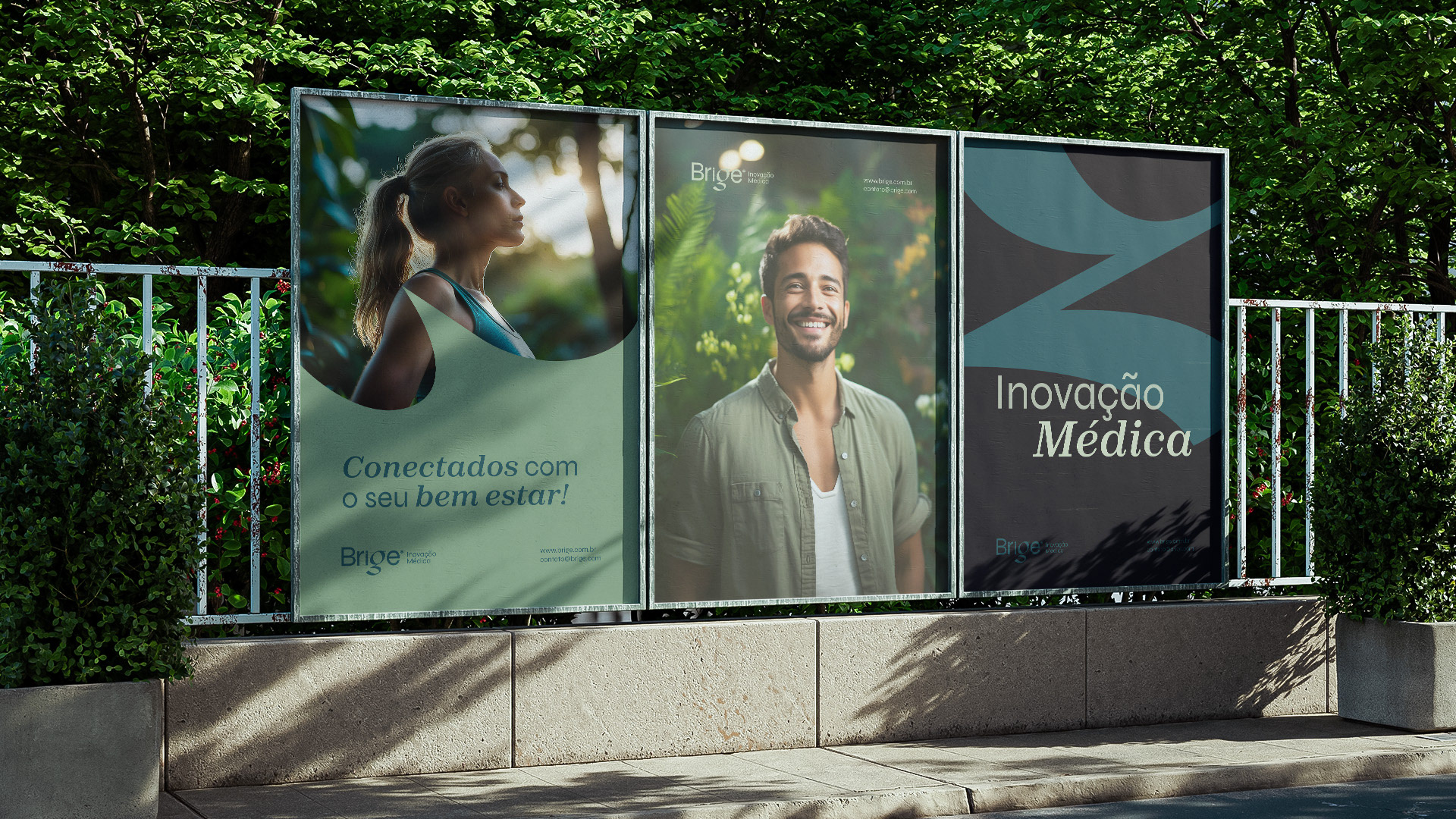
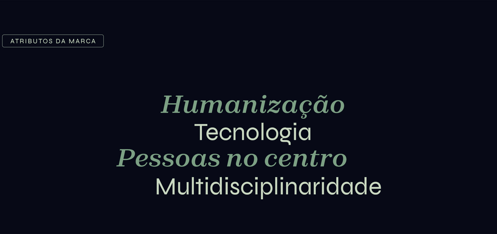
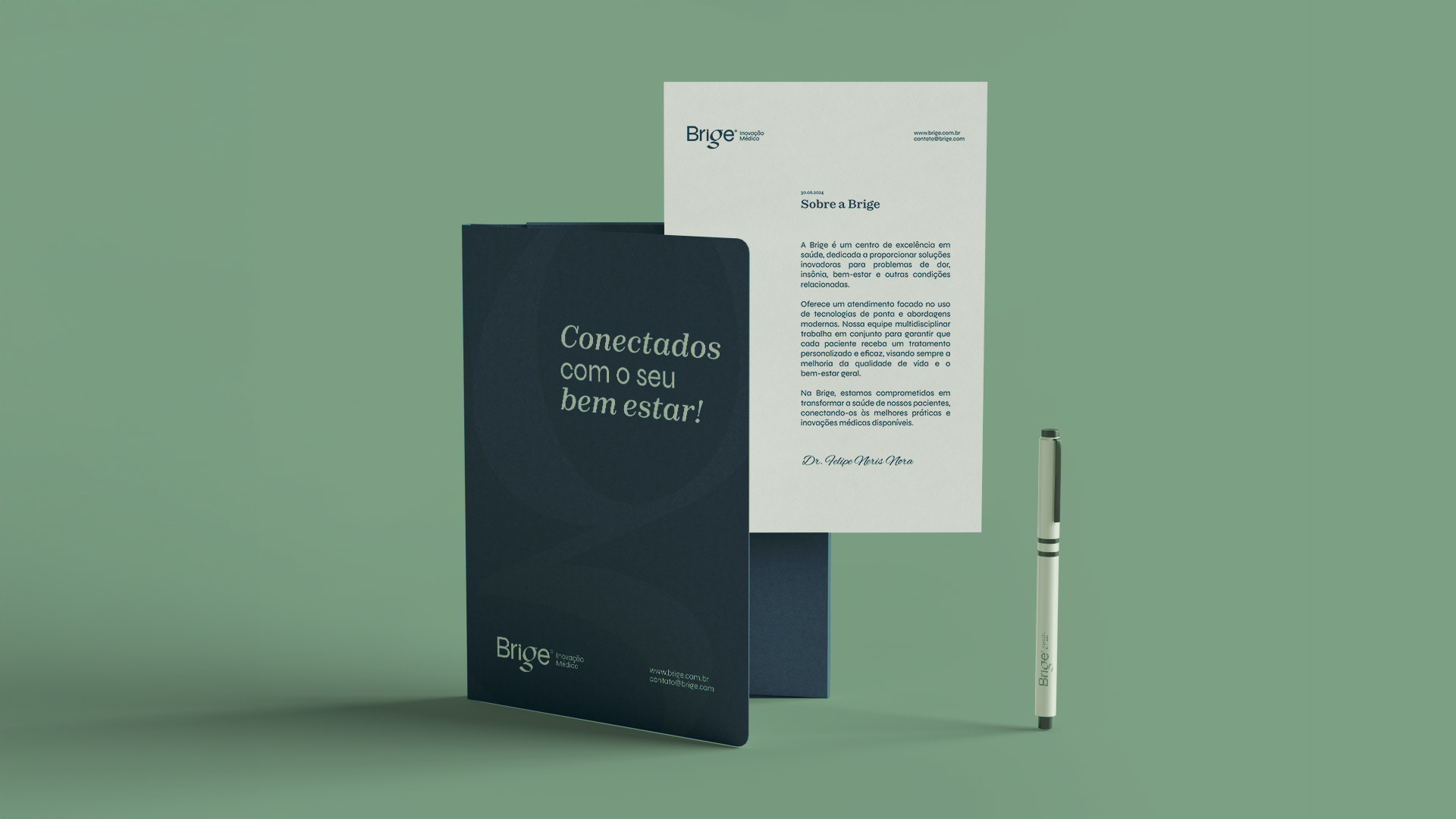
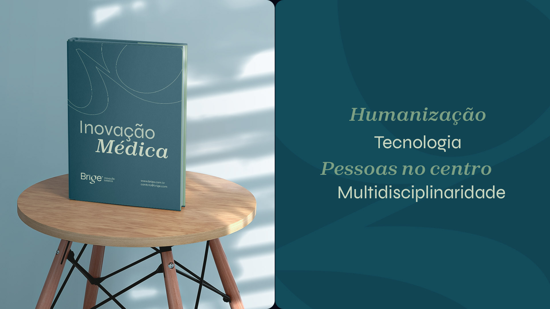
A Brige nasceu com o propósito de lidar de forma humanizada, tecnológica e com o paciente no centro de toda uma lógica multidisciplinar, para lidar com os problemas de dor, problemas de sono, ansiedade, falta de qualidade de vida e similares, para propiciar bem estar às pessoas e suas famílias.
[EN]
The project
Brige Clinic | Visual Identity | 2024
The project
Brige Clinic | Visual Identity | 2024
Brige was born with the aim of dealing with pain, sleep problems, anxiety, lack of quality of life and the like in a humanized, technological way, with the patient at the center of a multidisciplinary approach, in order to provide well-being for people and their families.

[BR]
Criação
do Nome
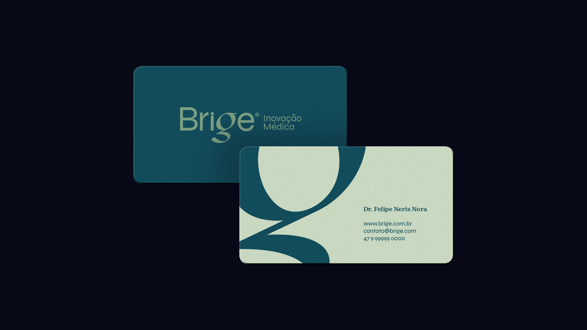
O nome "Brige" foi criado a partir da variação da palavra ponte, em inglês, "Bridge". Também, como variação do nome da deusa celta Brigid/Brigit que entre muitas representações, é tida como deusa das curas com o uso de ervas, medicina, agricultura, inspiração e aprendizagem.
A fonética da palavra, semelhante à "ponte" do Inglês, representa conexão, ligação entre profissionais e pacientes, também entre os profissionais para um atendimento integral-universalista.
[EN]
Naming
Naming
The name "Brige" was created from a variation of the English word "Bridge". Also, as a variation of the name of the Celtic goddess Brigid/Brigit who, among many representations, is said to be the goddess of healing with the use of herbs, medicine, agriculture, inspiration and learning.
The phonetics of the word, similar to the English "bridge", represents connection, a link between professionals and patients, and also between professionals for an integral-universalist care.
[BR]
Manifesto
& Conceito
[MANIFESTO]
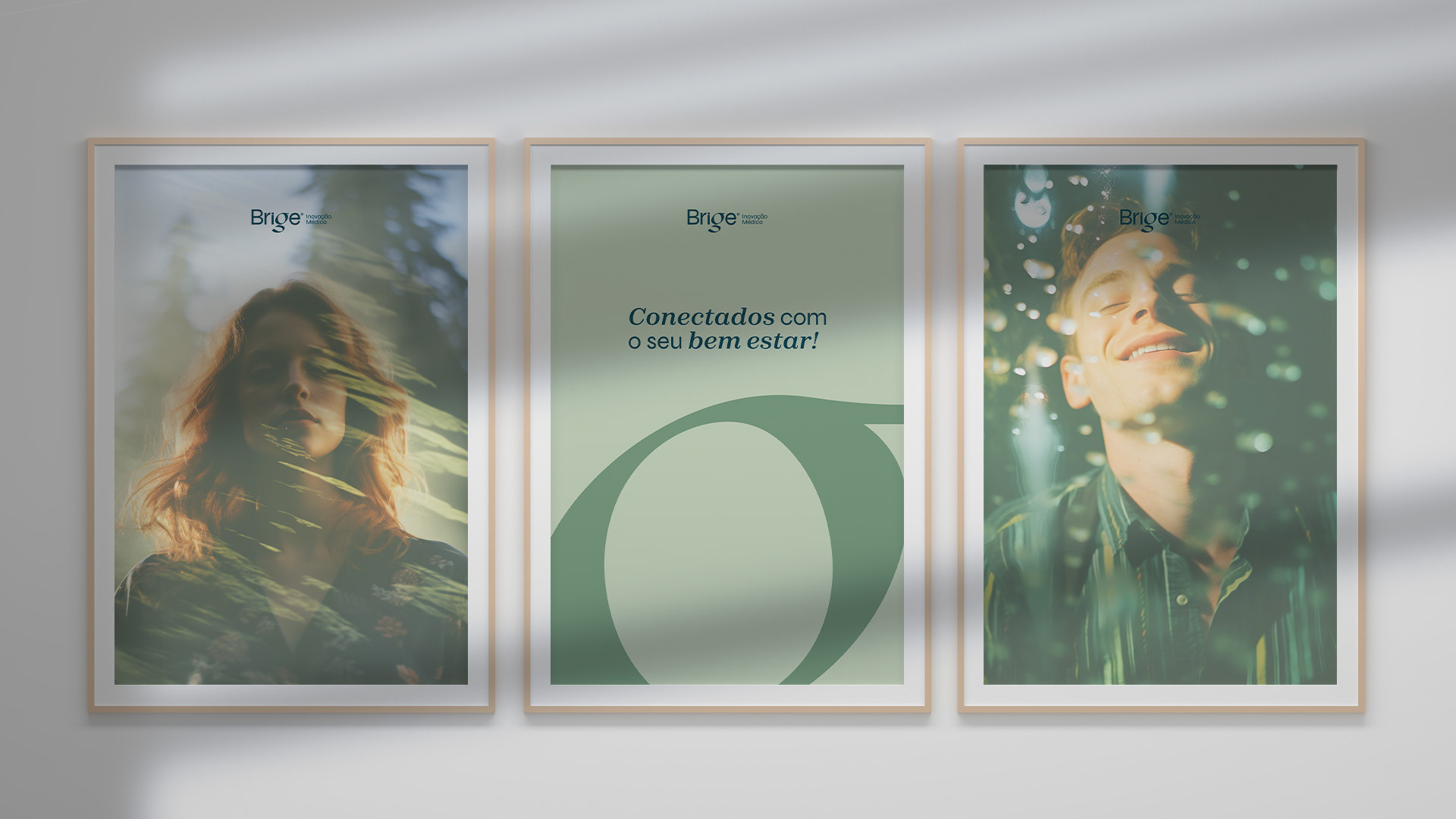
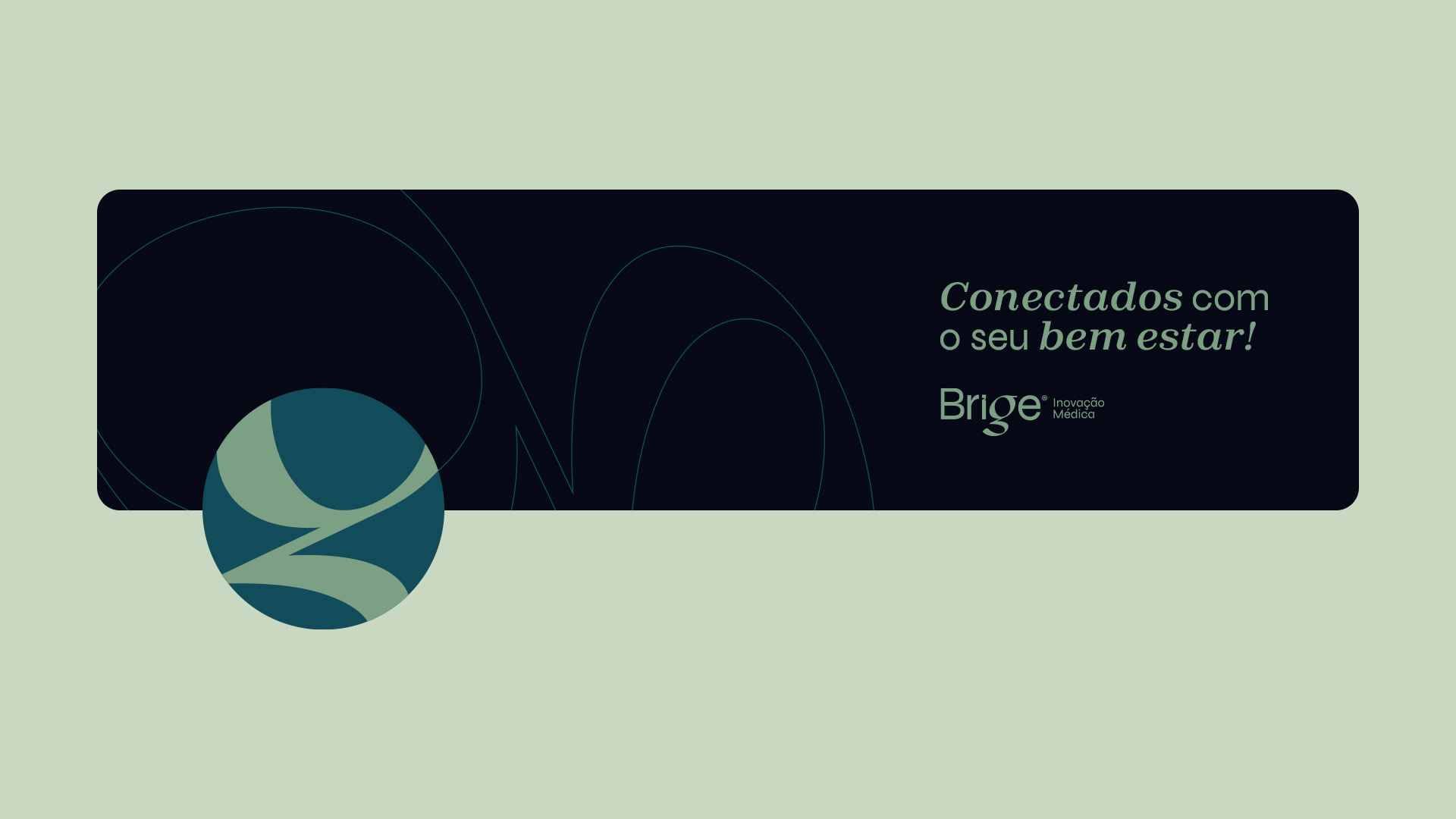
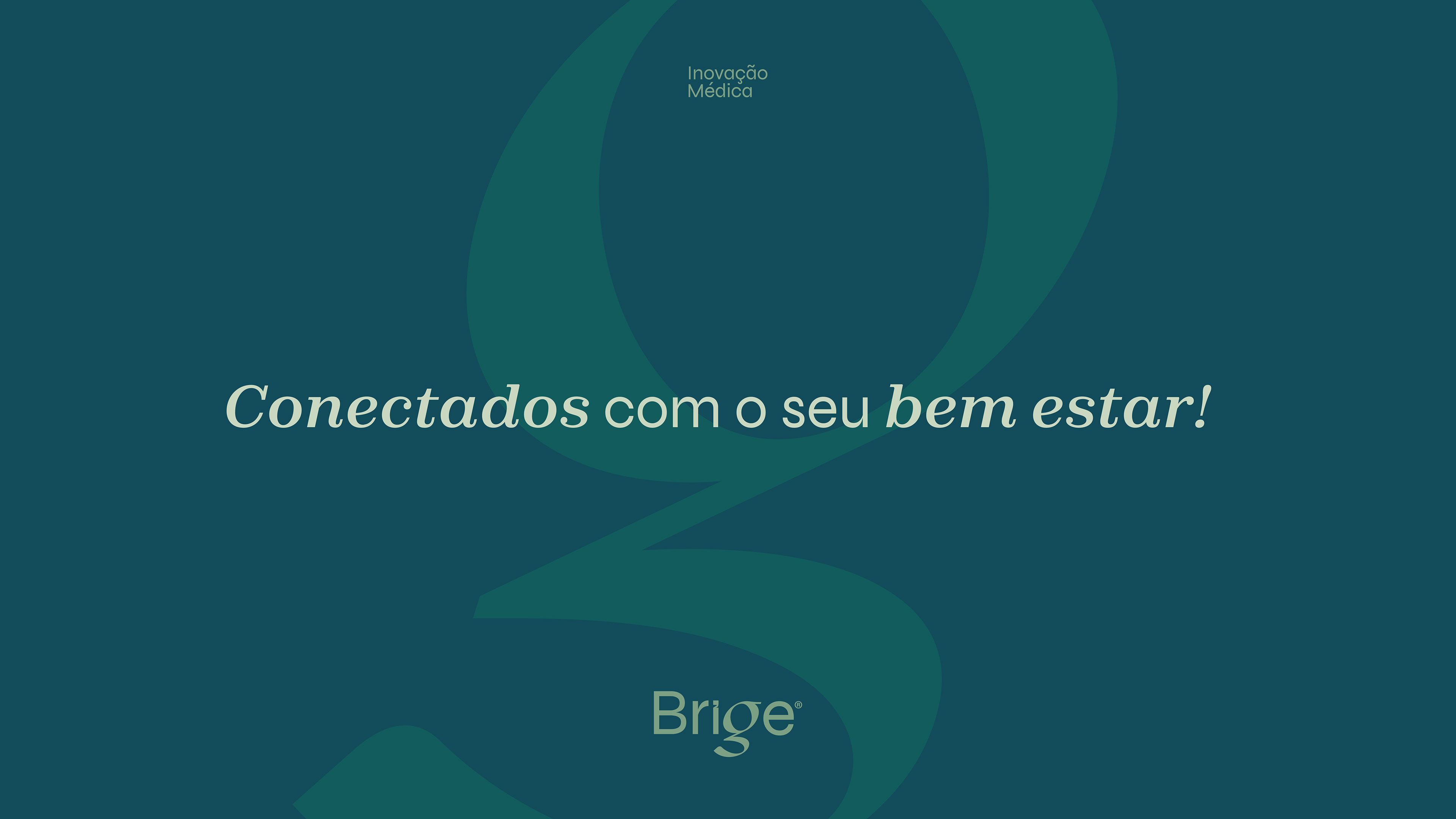
Brige é ponte que conecta.
Mas também que equilibra.
É o olhar para o ontem, para melhorar o amanhã.
É tech, mas também é sobre gente.
Brige é multi!
[CONCEITO]
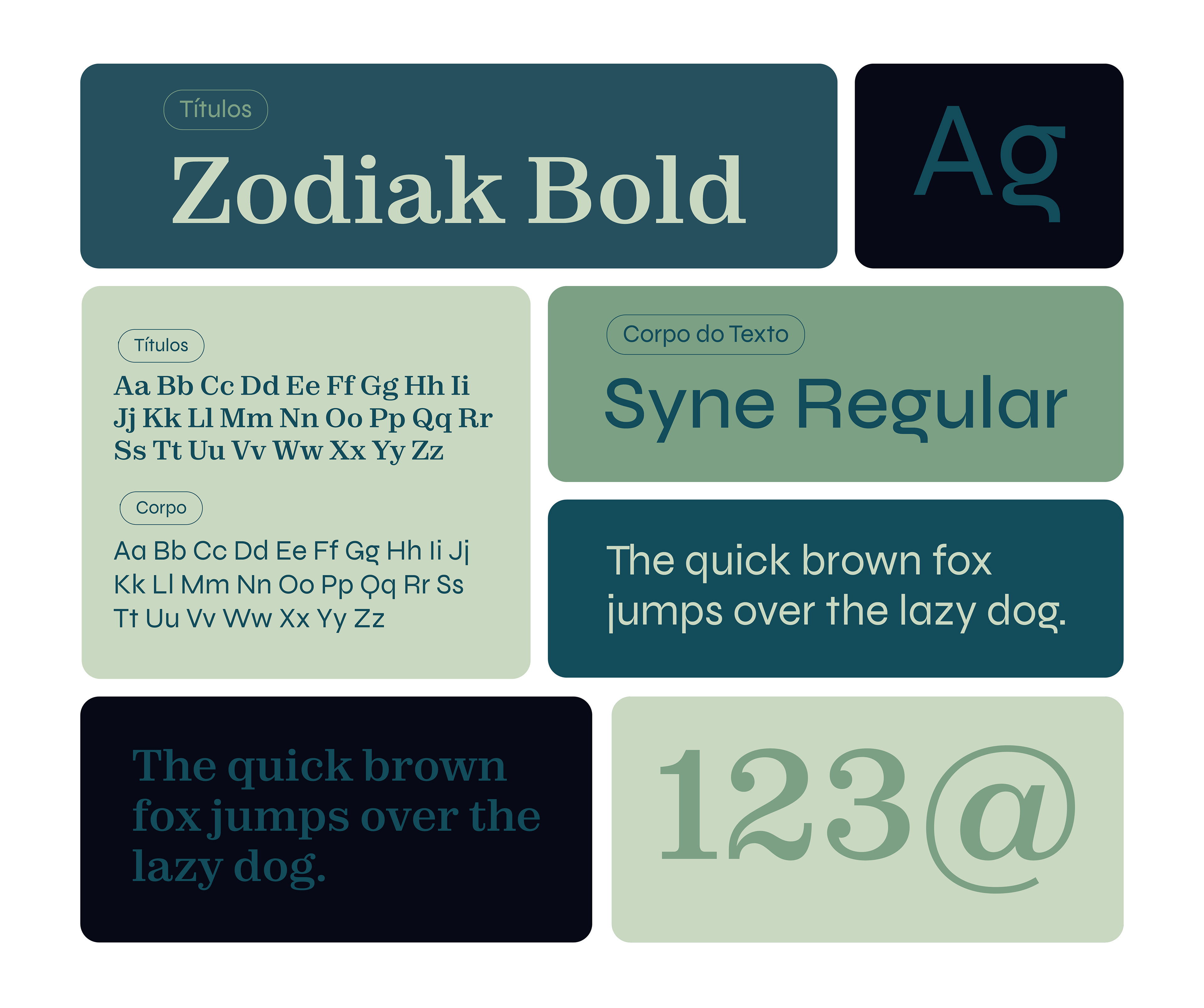
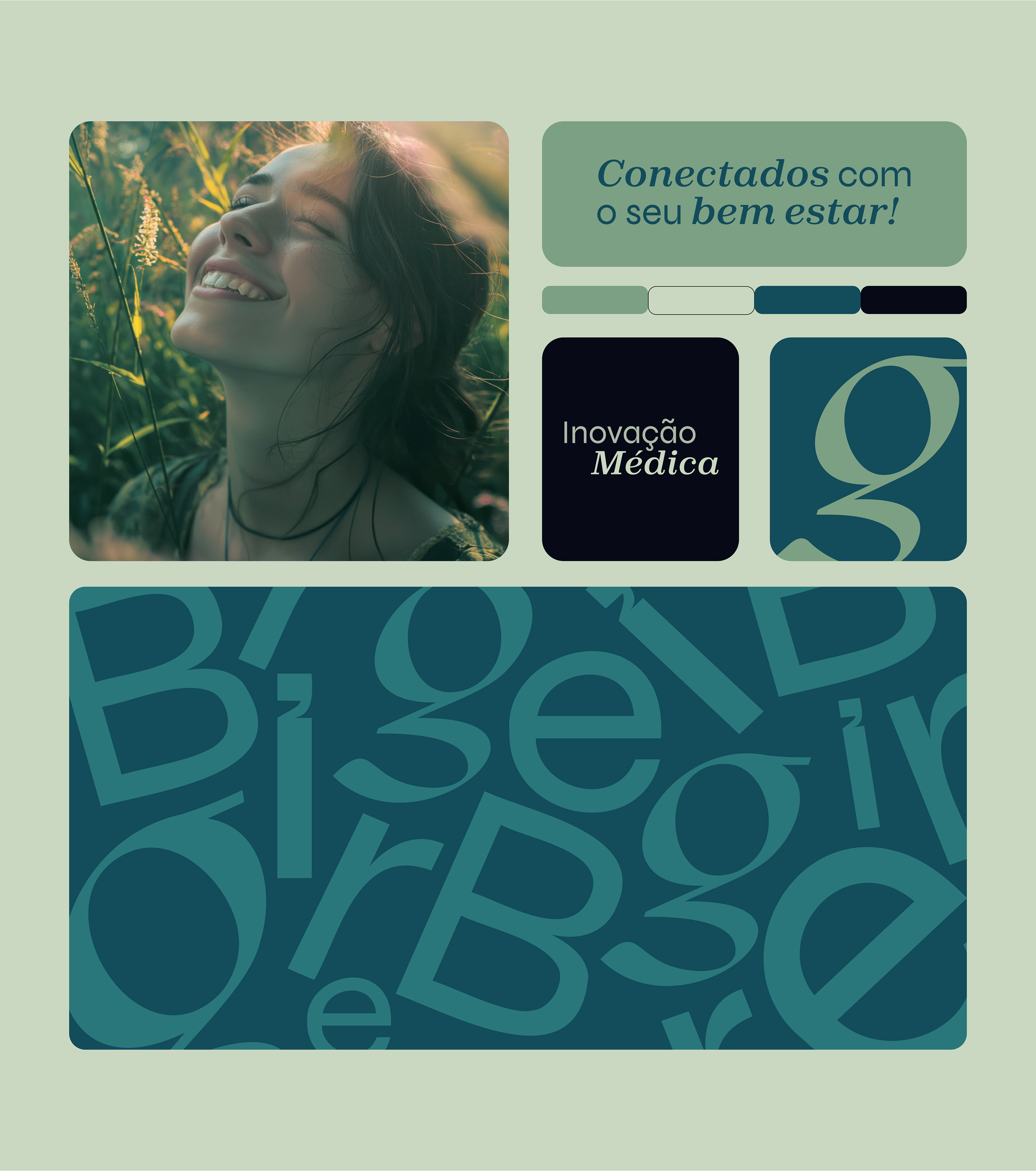
Para o conceito da marca, foi pensado em representar a dualidade entre tecnologia e humanidade de forma tipográfica, valorizando a palavra "Brige" que foi criada especificamente para o projeto. Através do uso da tipografia sem serifa Syne para mostrar o lado tecnológico e da tipografia serifada Zodiak para mostrar o lado humanista da marca.
Portanto, Brige segue uma linha tipográfica, com o “G” como grande ponto de destaque, contando toda essa história de forma conceitual e multípla.
[EN]
Manifesto & Concept
Manifesto & Concept
[MANIFESTO]
Brige is a bridge that connects.
But also one that balances.
It's looking at yesterday to improve tomorrow.
It's tech, but it's also about people.
Brige is multi!
Brige is a bridge that connects.
But also one that balances.
It's looking at yesterday to improve tomorrow.
It's tech, but it's also about people.
Brige is multi!
[CONCEPT]
For the brand concept, the idea was to represent the duality between technology and humanity in typographic form, highlighting the word "Brige", which was created specifically for the project. Through the use of the Syne sans serif typeface to show the technological side and the Zodiak serif typeface to show the humanist side of the brand.
For the brand concept, the idea was to represent the duality between technology and humanity in typographic form, highlighting the word "Brige", which was created specifically for the project. Through the use of the Syne sans serif typeface to show the technological side and the Zodiak serif typeface to show the humanist side of the brand.
Brige therefore follows a typographic line, with the "G" as the main highlight, telling the whole story in a conceptual and multi-faceted way.


Ficha técnica
Direção de Arte: Gabriela Luísa da Silveira | Brand Designer: Davy Sell | Atendimento: Fernanda Teles
Agência: Cingu - Branding e Marketing Digital | Ano: 2024 | Cidade: Joinville/SC
Cliente: Brige - inovação médica